 Hariom Prajapati
 30 Jul 2022
 CSS
CSSIt is use to create background using mixing of two or more colors.
a) Background linear gradient
It is use to create smooth transition of two or more color in background.
Syntax -
background-image:linear-gradient(direction, color1,color2, ...);
Values
| direction |
It is use to show direction of color gradient To right , to left ,to top, to top left, to top right ,to bottom , to bottom left , to bottom right . Also use direction as a degree 90deg,180deg, 60deg, 45deg , 25deg, 30deg, 360deg , 15deg or degree. |
| color | It is use to describe colors value to be use in a color gradient. |
For example -
<!DOCTYPE html>
<html lang="en">

<head>
	<meta charset="UTF-8">
	<meta http-equiv="X-UA-Compatible" content="IE=edge">
	<meta name="viewport" content="width=device-width, initial-scale=1.0">
	<title>Teknowize</title>

	<style>
		h1 {
			background-image: linear-gradient(to right, red, orange, yellow, green, blue, indigo, violet);
			text-align: center;
			color: #fff;
		}
	</style>
</head>

<body>
	<h1>Welcome to Teknowize</h1>
</body>

</html>
Output

b) Background repeating linear gradient
It is use to create smooth transition of two or more color in background with repeat same gradient according to width.
Syntax -
background-image:repeating-linear-gradient(direction, color1,color2, ...);
Values
| direction |
It is use to show direction of color gradient To right , to left ,to top, to top left, to top right ,to bottom , to bottom left , to bottom right . Also use direction as a degree 90deg,180deg, 60deg, 45deg , 25deg, 30deg, 360deg , 15deg or degree. |
| color | It is use to describe colors value to be use in a color gradient. And also need to show color percentage for repeat color gradient. |
For example -
<!DOCTYPE html>
<html lang="en">

<head>
	<meta charset="UTF-8">
	<meta http-equiv="X-UA-Compatible" content="IE=edge">
	<meta name="viewport" content="width=device-width, initial-scale=1.0">
	<title>Teknowize</title>

	<style>
		h1 {
			background-image: repeating-linear-gradient(red, yellow 10%, green 20%);
			text-align: center;
			color: #fff;
		}
	</style>
</head>

<body>
	<h1>Welcome to Teknowize</h1>
</body>

</html>
Output

c) Background radial gradient
It is use to create smooth transition of two or more color in background in the shape of circle or sphere.
Syntax -
background-image: radial-gradient(shape size position,color1,color2, ...);
Values
| shape |
There are two type of shape in radial gradiant.
|
| size |
There are four size of the radial gradient.
|
| position |
Default position is center. |
For example -
<!DOCTYPE html>
<html lang="en">

<head>
	<meta charset="UTF-8">
	<meta http-equiv="X-UA-Compatible" content="IE=edge">
	<meta name="viewport" content="width=device-width, initial-scale=1.0">
	<title>Teknowize</title>

	<style>
		h1 {
			background-image: radial-gradient(circle, blue, green, yellow, black);
			height: 200px;
			width: 200px;
			border-radius: 50%;
		}
	</style>
</head>

<body>
	<h1></h1>
</body>

</html>
Output

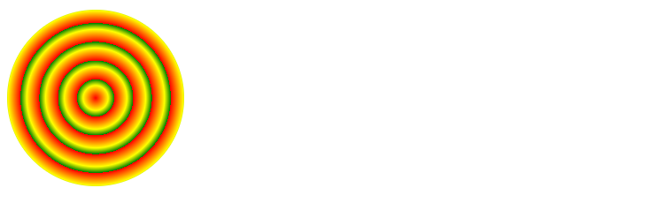
d) Background repeating radial gradient
It is use to create smooth transition of two or more color in background in the shape of circle or sphere with repeate same color according to width and height.
Syntax -
background-image: repeating-radial-gradient(shape size position,color1,color2, ...);
Values
| shape |
There are two type of shape in radial gradiant.
|
| size |
There are four size of the radial gradient.
|
| position |
Default position is center. |
| color x% |
All color with percentage for repeat color gradient. |
For example -
<!DOCTYPE html>
<html lang="en">

<head>
	<meta charset="UTF-8">
	<meta http-equiv="X-UA-Compatible" content="IE=edge">
	<meta name="viewport" content="width=device-width, initial-scale=1.0">
	<title>Teknowize</title>

	<style>
		h1 {
			background-image: repeating-radial-gradient(circle,red, yellow 10%, green 15%);
			height: 200px;
			width: 200px;
			border-radius: 50%;
		}
	</style>
</head>

<body>
	<h1></h1>
</body>

</html>
Output
e) Conic gradient
- A conic gradient is similar to a radial gradient.
- Both are circular and use the centre of the element but radial gradient emerge from the centre and conic gradient place them around the centre.
Syntax -
background-image:conic-gradient(color1,color2,.........);
Difference between radial gradient and conic gradient

Using this we can create pie chart or many more.
In radial gradient there is two attribute to define shape such as circle and ellipses , but in conic gradient there are no any attribute to define shape.
In conic gradient we need to use border tag for square shape or use borderradius tag along with border tag for circular shape or we can also use conic gradient with radial gradient tag but after write radial gradient tag we need to put only a comma (,) and then write conical gradient tag.
If we use radial gradient for shape then must need to write first color of radial gradient is transparent with 100% and second color will be same as background color.
Cicle or ellipse shape will be show when we set radial gradiant size as a closestside or set border radius is 50%.
Example-
<!DOCTYPE html>
<html lang="en">

<head>
	<meta charset="UTF-8">
	<meta http-equiv="X-UA-Compatible" content="IE=edge">
	<meta name="viewport" content="width=device-width, initial-scale=1.0">
	<title>Teknowize</title>

	<style>
		h1 {
			background-image:conic-gradient(red,blue,yellow,green);
			height: 200px;
			width: 200px;
			border-radius: 50%;
		}
	</style>
</head>

<body>
	<h1></h1>
</body>

</html>
Output

. To set (from , at , color range )
Syntax -
background-image:conic-gradient(from range at x-axis y-axis ,color1 start deg,color 1 stop deg, color 2 start deg,color 2 stop deg , ...............................);
from :
it is use to set angle from which degree the first color will be start (it should be negative value).
at :
it is use to set the centre point from where the center will be start and there should two value ,fist value for x-axis and second value for y-axis.
color range :
- It is use to set color range from where a color start and where they end.
- The color range value must be in percent (0% to 100%) or in degree (0 deg to 360deg).
- To set color range, we must have to write each color name two times, where in first we set from where color start and in second where color will end.
For Example -
<!DOCTYPE html>
<html lang="en">

<head>
	<meta charset="UTF-8">
	<meta http-equiv="X-UA-Compatible" content="IE=edge">
	<meta name="viewport" content="width=device-width, initial-scale=1.0">
	<title>Teknowize</title>

	<style>
		h1 {
			background-image: conic-gradient(from -30deg at 20% 25%, aqua 0deg, aqua 90deg, blue 90deg, blue 180deg, magenta 180deg, magenta 270deg, red 270deg, red 360deg);
			height: 200px;
			width: 200px;
			border-radius: 50%;
		}
	</style>
</head>

<body>
	<h1></h1>
</body>

</html>
Output
